top of page


End user test (WIP)
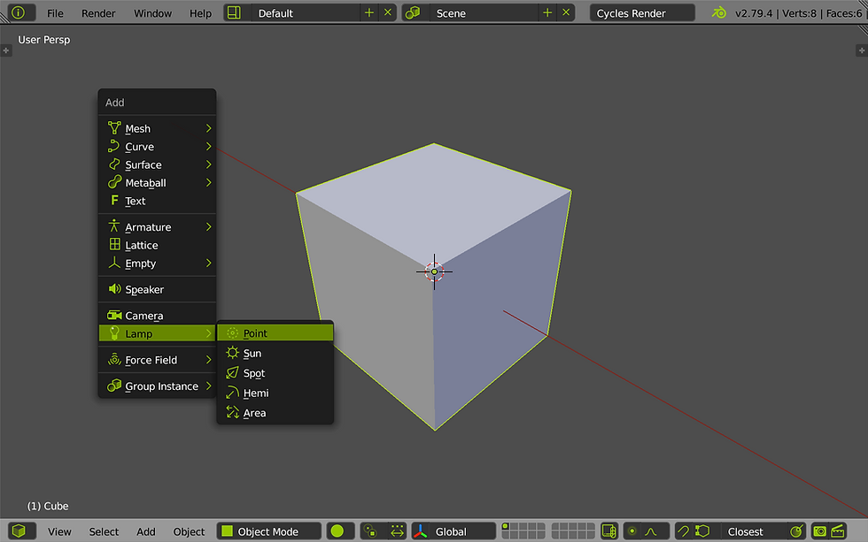
2.79
monoicon
Classic
"Light" Icons / "Dark" Theme

Even my goal was to create like "dark" theme with white icons, that seems to be still most popular color combination across apps, at the end the white version is not such visually clear.
Colored icons are simply easier to read between other elements on screen.
One of the reason (already mentioned) - spacing between elements.


Mono_Orange

Mono_Orange

Screen Shot 2018-04-21 at 19.48.41
Mono_Orange
1/16

Mono_bluelight

Mono_Blue

Screen Shot 2018-04-21 at 20.39.46
Mono_bluelight
1/15

Mono_Green

Mono_Green

Screen Shot 2018-04-21 at 20.08.42
Mono_Green
1/15
Single editor windows examples. This theme nicely merged "+" / "x" in info header without so much disturbing user eye. Hopefully these icons will be part of menu or on mouse over in 2.8.
blend-icon-green_0006

blend-icon-green_0010

blend-icon-green_0025
blend-icon-green_0006
1/19
Simple example how much space takes things arround.
Example is not enough fair since rectangles (needed to merge related elements) are missing in my version,
but you got the idea.

header_default

header_orange

header_white
header_default
1/5
bottom of page